E-Commerce Optimization / Product Page Best Practices
We previously discussed the wider concept of customer experience, but let’s focus on one of the most critical steps: product page conversion.
After all – this is the make-or-break moment. Do users convert into customers or not?
Users on such pages have found what they want – optimizing product pages will ensure they’re more likely to follow through and add something to their basket. So let’s examine the generally favored (and proven) design elements and the backend technology that helps you easily achieve this – the product page best practices, if you will!
Goals for Optimizing Product Pages
What makes a good product page? Put simply, it’s where customers get all the information about your products or services and choose to buy them. Every aspect of your product page design should be optimized to enable this one goal. After all, that’s why you run a business, to make money (unless it’s for pleasure – in which case we apologize ;D).
Of course, users are often browsing, too. As such, we also consider the wider customer journey:
- Accurately present products. In a store, customers can surmise a product at a glance – from its shape and size to cost and availability. Product pages need to achieve the same instant results.
- Inspire trust. A customer who makes a purchase with does so ‘blindly’. It’s imperative to remove all possible doubts and anxieties a potential buyer may have. You need to establish trustworthiness and credibility.
- Be intuitive. Where’s that button? How do I…? Intuitive product page design is essential. If it’s not as straightforward as possible, then we don’t need to tell you what happens next 😉Of course, there are also some larger consequences and influences to consider:
- Loyalty. An easier shopping experience will generate return visits, enabling customers to grow attached to your brand.
- Upselling. The easier product pages are to use, the more successful upselling initiatives will be.

The Key Elements of Product Page Design
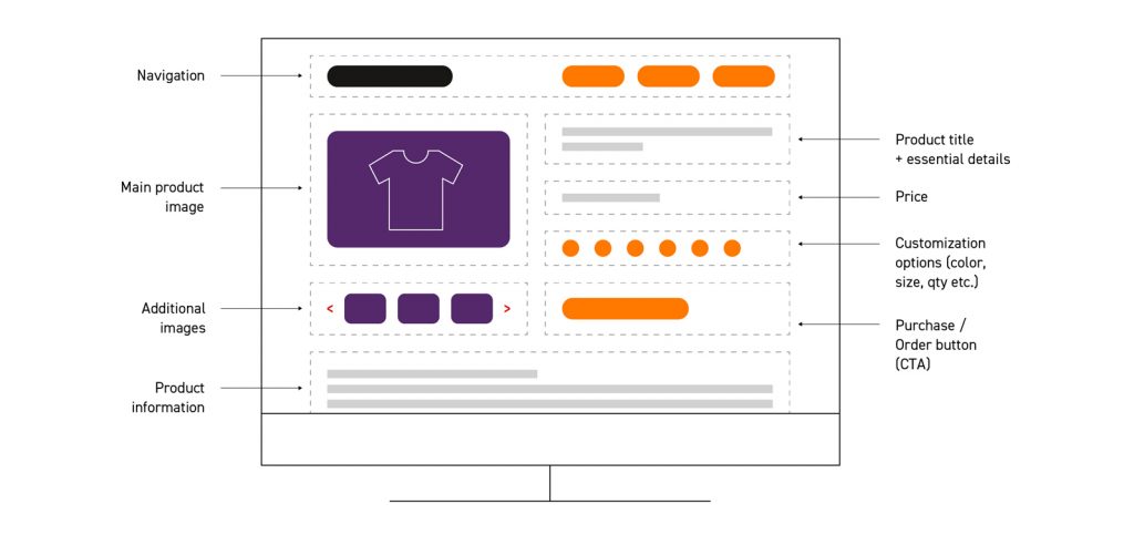
First impressions count. Before scrolling, users need to know they’re on the right page. So, let’s talk about the essential elements that need to go above the fold.
- Header & navigation. Why are we mentioning this for a product design page? Because a product page can often also be the user’s entry page. Perhaps it’s not quite what they want, but they’re willing to keep looking.
- Product name. Seems trivial, but it’s not! The product name ensures people know what they’re looking at.
- Product details & description. Above the fold, you should include the most important information about your product, including its price, size and availability. This should be connected to your PIM or warehouse inventory for real-time results – and delivery options, if applicable here.
Note: Only keep the essentials here. For other (but still useful) information, such as further product details, a more detailed description or even feedback from previous buyers. All of which help the buyer, but not as much as the core essentials. - Attractive pictures. In physical stores, assessing products is easy. Online, we need to use detailed pictures from every angle and with models, in cases such as fashion. Make sure such pictures are as high quality as possible and show all necessary variants: you don’t need to show every size, for example, but every color is highly recommended. 360* photos and carousels are also good solutions.
- Clear CTA. The purchase or order button should be clear and immediately visible. More than just simply allowing customers to achieve their own goals, it shows that this page, is in fact, part of the store. It removes all doubts.
Putting It All Together
All of the sections mentioned above need to appear above the fold – in other words, the parts that load immediately and answer the most pressing needs of the user. If your using existing templates from an existing B2C e-commerce platform such as Shopify, most of this product page design is done for you but, we’re talking about product page optimization, right?
So let’s acknowledge the multiexperience elephant in the room: we can’t simulate the same design for both desktop and mobile. Responsive design will help here but let’s go through it one step at a time. First: the desktop / web browser view:

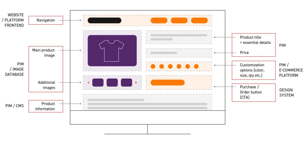
We’ll also assume you’re using a headless commerce system (or you should be!). Your website should of course be templated – so every product page is intuitive, familiar and the same – but drawing from a number of different data sources:

Here we can see, for example, your overall website or e-commerce platform, as well as an image database for product images, a Design System for the UI elements and a Product Information Management system for, well, we hope you can figure that last one out 😉
And Mobile?
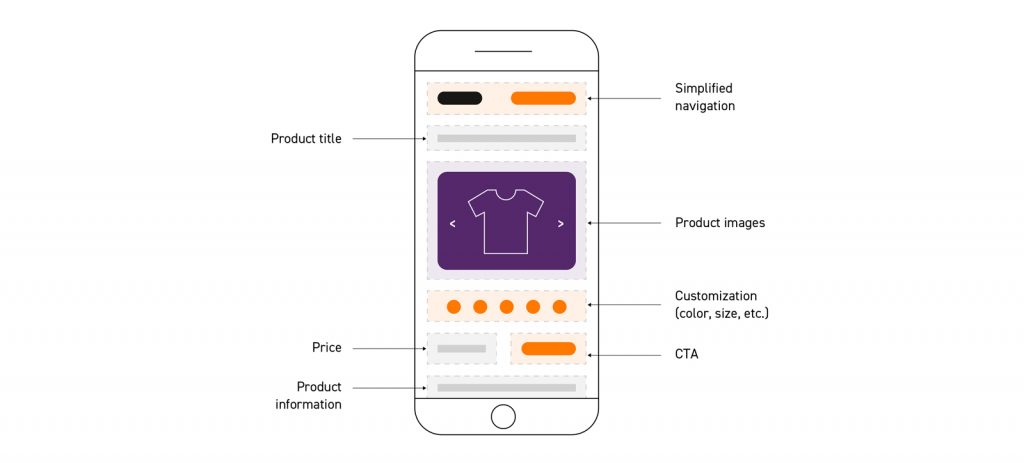
In an ideal world, we’d want to replicate all of the same elements. But if you want to truly make an impact in the era of mobile-first e-commerce, then we need to be a little more restrictive. The most important elements? Product description, images, price and customization options, and the CTA.

Notice here, however, that we’re hovering the bottom section, which includes the customization and ability to order, on-screen at all times. This enables scrolling for further content, such as a more detailed product description, but ensures the user doesn’t have to scroll all the way back up.
Thankfully, whether it’s responsive design, a headless PWA or even a dedicated app, we can use the same backend elements to stay consistent, ensure scalability and minimize human effort:

Moving Below the Fold
In theory, if your product page has all these elements, your sales chances increase significantly. However, this is not the moment to open the champagne, because online store optimization doesn’t stop there (and if it’s done right, it simply never stops 😜).
For people who aren’t convinced – or maybe just aren’t all that impulsive – we can add the following:
- Detailed and technical information. More than just product size, weight or material, you can describe how it works, what distinguishes it from other products of its type, what problems it solves, important technical details and even such issues as warranty and returns. Here you have a huge field of possibilities – just make sure that everything you write is true.
- Questions and answers. Many customers probably ask you the same questions. As you remember, they prefer to search for answers on their own. This is an ideal area for niche industries or products with specific needs.
- User reviews and recommendations. The opinions of other users often contribute to the decision to buy (or not). There are many options that can be integrated here.
- Recommendations. At the start, we highlighted upselling as a goal. Here, we can take the opportunity to introduce the user to other products they may enjoy. Ideally, we should implement a smart recommendation engine to add personalization. This will keep the customer longer and increase the chance that they will leave your store with not one, but several products.
But Did It Work?
In any optimization project there are two key stages: action and analytics. Now we’ve optimized the product page design, we need to see if it actually worked. For that, we need to look at user behavior.
Analytics like Google Traffic will show us if navigation works, how long people stayed on each page and even if they converted (although most e-commerce platforms will have better analytics for that lst one). But, we should also use tools like Hotjar to see exactly how users engage with a page:
- How many went through all the images, video and other media?
- How many needed more detailed information before purchasing?
- How many struggled to order the right size, quantity or variation?
Doing so will indicate key areas of improvement. Users keep searching below the fold for a key detail? Move it up!
Don’t forget that we can also split this by country and device. This way we can be sure different markets don’t have different habits, or that each device is working optimally for that specific channel.

How to Test
The page is analyzed and new ideas proposed – but updating the base template isn’t the best step forward. Instead, let’s A/B test with a variant template. This can then be displayed to a small batch of users and tested.
- It rules out other factors like time (in case the variant was tested on a better week for your industry etc) and allows for failure.
- If the new version has a flaw, we haven’t sent it to the entire customer base.
- Testing too much at once is also a problem as we won’t know which elements directly caused improvements, or which were hidden drawbacks. A/B testing allows us, when needed, to test more specific variations.
What About the Backend & Performance?
Of course, the frontend and pretty visuals all need to sit on strong foundations. In the backend, we can look to microservices and other integrations to find areas of improvement. We’ve mentioned the likes of PIM, Design Systems and other headless approaches for a reason: a lighter API approach reduces unnecessary elements on each page.
For example, we’ve stressed the need for high quality images but we also know that high quality often equates to large file sizes. Well, here we can use a WebP image converter to use web-friendly compression to ensure the same results at a lower scale…. resulting in faster pages, less frustrated users.
Reap the Rewards of Your Work
Optimization is a continuous process. In order to continuously increase your e-commerce revenue, you cannot rest on your laurels.
If you don’t forget that your store is first and foremost for your customers (and not, as it may seem, for you), then we are sure that your results will skyrocket. However, we’re not talking about innovation for innovation’s sake. Experiment, test and repeat.


