Digital Accessibility & Usability / A Visual Overhaul
Nearly every industry these days has an online element – in some cases, it’s the predominant channel. And that’s great – if you don’t have any accessibility requirements.
But as more and more of the world moves online, we need to consider the wider needs that different people may have. For example, we already make it as easy as possible for people to change a website or app’s displayed language – often in just 1-2 clicks – so why don’t we do the same for other needs, too?
Here, we want to talk about:
- Visibility challenges and how to solve them
- The technology to enable accessible web design as effectively as possible
- How to test your new web accessibility
In later posts, we’ll take this even further with:
- Customer Support
- Post-Sales Operations (Logistics and Returns)
- Additional challenges that can impact a potential customer’s ability to use your service
A Digital Experience for All
It should go without saying, but inclusion is our goal here. And from a business sense, it’s a very logical one, too! Many people around the world have various accessibility or usability requirements, and yet most websites fail to meet them. Adapting your digital presence to cater to everyone opens up your target audience and improves the digital customer experience for all.
This need for greater internet accessibility is true for any industry. We can talk about the e-commerce context for days, but web portals and other account-based services also need to implement this. After all, everyone needs to be able to log into their bank, right? In fact, in many parts of the world, accessible web design is a legal requirement for public entities.
In these cases, providing a specialized experience will greatly enhance the personalization level of your service.
Visual
When it comes to the visual representation of your business, we need to adapt to a wide range of visual impairments:
- People with color blindness, for example, will have difficulty to contrasting two sets of colors apart. Typically, this is red-green or blue-yellow, all with varying degrees, while some are monochromatic – meaning they see no color at all. This impacts 1 in 12 men and factoring in women (1 in 200) as well, there are around 300 million color blind people afflicted.
- Similarly, people with poor eyesight (such as the growing segment of senior shoppers) will struggle with small text and details.
- Also – we’ve said it before and we’ve said it again – we need to adapt the experience to every device in a multiexperience way. After all, what’s visible on a website might not work on a smartphone.
For more information in this area, we recommend researching the Web Content Accessibility Guidelines (the current standard is WCAG 2.1), from the W3C organization. This is global standard is often referenced for accessible web design.
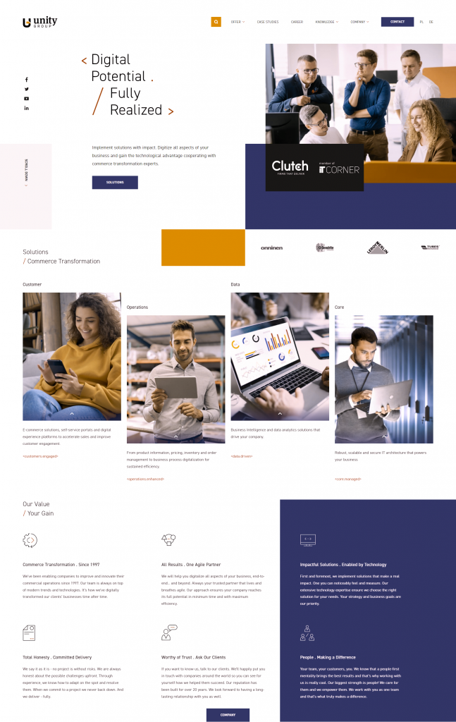
There are many tools online that can demonstrate the first point clearly. For example, we’ll use our own website. Here’s how it should look:

And here’s how it looks for someone with deuteranomaly (red-green blindness) for example:

*okay, we understand that if you have color blindness, we just showed you the same image twice. Sorry about that!
So, What Can We Do?
The biggest and easiest way to adapt the frontend for everyone – aside from implementing accessible web design in the default view – is to add a high contrast mode.
We previously spoke about Design Systems and such a headless approach will be essential here. With this, we can create an alternative view, loading the same page but using assets from a secondary library – one that specifically contains color choices and designs to ensure maximum accessibility.
Why a Design System, specifically? Because we want to be able to roll out changes automatically, ensure any new pages are already in both styles and otherwise ensure no rock is left unturned – all while maximizing staff efficiency as much as possible.

Of course, depending on your design, it might not be such a walk in the park. What if buttons are too small, for example, for everyone to see? In this case, we need to go a little further back to Atomic Design:

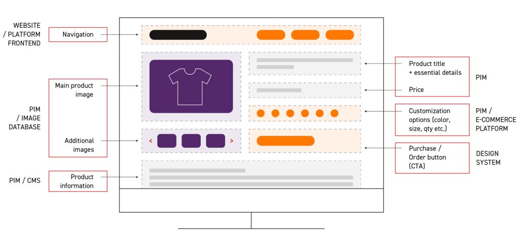
Here, we take the same atoms, and simply design molecules and organisms that are bigger. Sure, this might end up requiring different templates but, again, we’re doing the hard work now to save ourselves a lot of time in the future.
It’s also worth noting this approach doesn’t impact wider content delivery, such as product information or general content. As we discussed previously on product pages, these are fed by different backend systems (such as PIM or CMS) but are still influenced visually by the Design System and frontend.

One more thing: red-green color blindness means typical yes/no colors (red for wrong, green for right) won’t work. Keep this in mind when designing input fields, visual feedback and other elements that might get overlooked when upgrading your site accessibility.
Contrast is Everything
When dealing with color blindness and other website accessibility issues, contrast is a significant factor in determining two things apart. When two colours of different hues have the same saturation and values, they look the same (or very very close in greyscale), so what might look very different for most people might be much more difficult to discern for those with visual impairments.
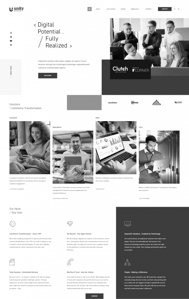
The best practice here of course, is to avoid such issues entirely. For example, here’s our home page again, but this time in greyscale – as seen by someone with achromatopsia:

But failing that, it an essential factor for any alternative visual modes. If in doubt, there are numerous plugins to help identify areas of low contract – such as the Web Accessibility Evaluation Tool.
How Do We Know it Worked?
We previously spoke about some vital e-commerce statistics and that included a few web-generic factors too, such as bounce rates etc. So, touching on this topic a little more deeply, there are some easy metrics we can use:
- If we have a dedicated vision-impaired mode, we can track how often it is used. That’s a very clear indicator.
- This can then be supported with general traffic and activity markers. Are people using this feature spending more time on the website or in the portal? Do we see more features being used now they are accessible?
- It’ll also help us see which areas still need to be improved. We don’t always get it right on the first try. Remember: test, analyse, repeat.
- We can also see if this correlates to a decrease in bounce rates and other negative factors.
- Finally, we can also add a pop-up or questionnaire to simply ask people to rate/review the efforts.
On a final note, it’s worth pointing out that inclusivity shouldn’t be weighed as an actionable choice. Just as we ensure our physical offices and stores are accessible, so too should we treat our digital operations the same way.
Adapting to the needs of both existing and potential customers should be an obvious inclusion in any digital strategy – not something to react to when competitors make the first leap forward. We hope the suggestions and advice here simply show that it doesn’t need to involve ground-breaking new technology, but a few considerate choices with your existing architecture.


